

Ranking Fulham’s top 10 Premier League home kits

Will Gardner ranks what he believes to be the best FFC tops of our Premier League era.
It appears that water isn’t wet and it seems that pigs can fly, as Fulham are set to unveil their 2023/24 kit before pre-season has even started. Frustration over a delayed kit launch had been as ever-present in the summer months for Fulham fans as links with Dwight Gayle, and it finally appears that we will get neither this year.
A kit release is something that is naturally exciting for us Fulham fans, but always feels a tad underwhelming. Adidas seem to put all their marketing and design budget into bringing out about eight kits a year for Arsenal and forget that we are also a Premier League football club they design kits for. And this slip of the mind from them last year caused a rush of PR bollocks to state that our away kit was reminiscent of Stevenage Road brickwork, which everyone and their mums saw right through.
There are rumours that our contract with Adidas is up, and if that’s true, there’s still no indication of who the new manufacturer will be.
Ahead of the release, I thought I would undertake the thankless task of ranking my 10 Fulham home kits from our time in the Premier League, and open up myself to a barrage of slander from fans who completely disagree with my fashion choices.
I’ve tried my best during this to take the performance of the season out of the question and purely focus on the kit at hand, but it’s hard to think positively about a kit that you watched the most turgid depressing football in, but we’ll try our best.
10. 2011/12

Regarded by some as the “athletic Stormtrooper kit”, this number on paper should be nowhere near the Top 10, but it’s hard to not feel romantic about a kit that has donned Bryan Ruiz dinking keepers in it. Seeing it on the lads makes it look half decent as well; it’s certainly a kit that they can pull off and one that should be kept as far away from the terraces as possible.
The famous Kappa logo on the shoulders gives it an air of Italian sophistication that isn’t only enjoyed by our very own Jack Collins, but can be appreciated even by the day-trippers who’d would be scattered through the Riverside. Venezia vibes before Venezia was fashionable. It’s a niche that is near impossible to replicate and as Hummel have tried to find their own unique spin on kits by chucking chevrons on shoulders, they’ll never reach the style heights of Kappa.
On that note, I’ve seen a fair few cries for Hummel to be our new manufacturer and I couldn’t disagree more. While they’ve managed to produce a couple of nice kits, a broken clock is right twice a day, and for the most part the kits are forgettable and appear to be dated in their design and launch. Or maybe I am just biased as they’ve been worn by two appalling teams in Everton and Southampton over the past couple of years.
9. 2018/19

You know what, this is a solid kit – a great little number for our return to the Prem – but ultimately a bit of a nothingness. It’s got a bit of the retro vibes with the adidas stripes on the shoulder, and the band across the middle has a little nod back to our Demon Internet days.
The only problem is that it feels as formulaic as kits come; it definitely looks like a template Adidas have had on their shelves for years gone by and for years to come, in no way does it feel unique to Fulham.
Also the less spoken about the season we had in this shirt the better; it was grim and while I am trying greatly to not let that sway me, I’m finding it near impossible to not be triggered by it. But truth be told, if we had performed even half decent this season this probably would have found itself higher up the ranks.
8. 2007/08

I feel this is where I may have lost you, but for me I’m a fan of this all white number. The slightly baggier fit and the all white collar makes it pretty unique. I’m unsure if it’s simply because the Ashes are on at the moment, but it gives an heir of cricket whites, and seeing as cricket is seen as a posh sport and we’re seen as a posh club, i think the two go nicely hand in hand, and it can wind up opposition fans in the process.
This kit has been largely forgotten as the crowning moment from this season was whilst Danny Murphy was wearing our black and red away strip, so this all-white shirt with LG emblazoned across the front has fallen back in our memories.
7. 2020/21

If I’m honest, I’ve been completely swayed by the god awful season in this shirt and haven’t put it higher. Objectively, it’s a great kit, but looking at it now I’m getting flashbacks to lockdown, and a million passes between the back four, Cav up front, Loftus-Cheek coming on and doing nothing, I just can’t put it any higher.
But the white collar among the black shoulders really helps this stand out and gives it a really unique look amongst any of our kits. There’s a little emblem on the back of the shirt that the PR release said was something to do with the design of the railings in the Cottage. During the teaser it seemed like it would have more of a presence than just sitting above the names, maybe even a hint of a new crest, but thats a conversation for a different day.
6. 2012/13
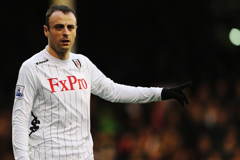
You’ve gotta respect Kappa for trying something a little different here; when a team’s colours are white and black, you’re left with little room to work with. But here we are, the one and only time in our Premier League history rocking some pin stripes. (We had some more stripes in our first season back in the Championship, with the orange trim. It was grim.)
The Kappa logo has moved from the shoulders to the love handles, FXPro is screaming at us, and from my memory we announced this pretty early on in the summer.
It was something different, I quite liked it, but it doesnt quite reach the top five for me.
5. 2010/11

Here’s another Kappa number and in a slightly more retro vibe then their futuristic number we wore a year later.
It had a subtle Kappa logo on the shoulders, the crest and kappa both sit quite high, again something a bit more unique across these shores. But the main highlight is the collar for me; not quite a v-neck, not quite a crew neck. Who knows thats going on there, but it rounds the kit off nicely.
It helps as well that we finished eighth in this kit, Clint Dempsey had one of his best seasons in a Fulham shirt, and we saw Dembele run rings around aging midfielders.
4. 2003 – 05

The only one in this list from the Puma stint as the early-to-mid 2000s really lost their way with kits and style. I’ve selected this one over the other Puma efforts due to it being the perfect mix between unique and understated.
Centre crest – brilliant. The long sleeve version was elite. the dabs.com logo was inoffensive and subtle. A solid shirt during a wild time in the Barclays.
3. 2009/10

How can you not love this kit? With its black sleeves and colour, with the flashes of white running through it. It’s simple but unique, and, of course, it was worn by the lads on the way to a European final.
It may not set the world alight, it may not be a groundbreaking design, but I think it emulates the Roy Hodgson era perfectly. You could wear in the terraces if you were that way inclined, but it will work as a retro look in 20 years.
LG is a largely inoffensive logo – I mean, who isn’t a fan of microwaves and TVs? That simple Nike swoosh among a sea of white just typifies the time period.
But ultimately Bobby Zamora played like R9 Ronaldo in this kit so it’s in the top three for me.
2. 2022/23

There was a lot of hullabaloo when this kit was launched due to the return of a betting sponsor, the year after we had a company that provided free internet to third world countries, or something like that. But at the end of the day it’s a proper nice kit.
The sponsor works well on the front, the iconic adidas stripes are on the shoulders, but at the end of the day the little subtle red lines on the hem of the sleeve and on the colour really makes it stand out and helps what could be deemed as a boring kit into something special.
I said I would refuse to buy this kit due to the betting sponsor, but I think I’m going to be a massive hypocrite and see if I can sneak it for a discount when the new one is released.
It was a beautiful kit during a beautiful season, and how good does Palhinha look in it?
1. 2001/02

It had to be didn’t it? Our first kit in the Premier League, the most iconic Fulham sponsor, a baggy fit, a colour, it’s peak 90s despite it being (just) in the 2000s.
It could so easily have been a replica of the Demon Internet kit from the years before, but the hints of red running through it on both the colour and the stripes on the sleeves. The black armpits to again break up the white.
Ultimately an authentic version of this shirt is hot property, not the budget replica the club tried to ship out a couple years ago, and there’s a reason why. It’s the greatest for me; it screams Fulham. When I see it all I can think about is Saha leaving defenders in the dust.
Some might scoff at this list, some might renounce my fandom for selecting Pizza Hut at number one, but for me these are the best and some of the most iconic kits we’ve had in our time in the Prem.
If this list is completely off, I’d love to know what your top three would be and if you would have included any of the ones I left out.