


Ah, the summer of 2001.
Those of us around with memories of that time will all have different experiences. My recollections come as a 14 year old, who was so excited to finally be able to join the Premier League conversation.
For years I was subjected to Accrington Stanley-style jibes when asked who I supported.
“Fulham? Who are they?”
Even when we were scalping the likes of Southampton, Tottenham, and Aston Villa in the domestic cups, it was the easiest line to draw a laugh.
But that all changed in 2001 after we romped the old Division One.
The weeks following the end of the 2000-01 season were some of the most exciting I remember as a Fulham fan, as we prepared for our Premier League debut. I will try to recapture some of that magic in this series.
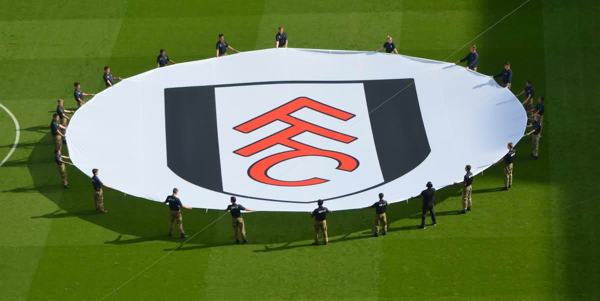
It all started with the unveiling of our new badge - the 10th in our history.
All things considered, it remains the most divisive element about our club (aside from perhaps Tony Khan). And when it was introduced in 2001, less than three weeks after the end of the season, the reaction wasn’t particularly warm. If there was social media back then… well, you can imagine the uproar.
But with the internet in its infancy, the reveal was made in the form of a glossy brochure sent out to season ticket holders and members, detailing the rebranding procedure, following club-issued research that showed just 14% of football fans actually recognised the club’s current crest, which was at that point six years old. The pamphlet was awash with classic marketing spiel, from detailing fan consultations to talk of ‘brand identity’.
"The new image has been designed to reflect the core values of the club,” MD Michael Fiddy said at the time.
A simple black and white shield was a nod to the centrepiece of our previous crest, while the red FFC monogram running down the middle was an homage to initials-based badge that adorned the shirts of our 1975 FA Cup finalists. I’d argue that the monogram is not quite the “optical illusion” The Sun recently purported it to be (and if you didn’t notice it said FFC until that rag pointed it out, then I dunno what to tell ya).
Core values and brand identity aside, the new badge was about the club safeguarding future revenue as a member of the richest league in world football.
Whether you believe the argument that the Hammersmith and Fulham Council own the rights to the old crest or not (there appears to be some debate over this), the club’s decision to create a new, fully ownable insignia makes complete sense, and so it’s proved.
I’ve never been shy about professing my love for the badge. It’s not everyone’s cup of tea, but it’s been present for the most successful period of our history, from our highest-placed Premier League season to the Europa League final and beyond. But to this day there’s still sections of the fanbase desperate to revert to our Division One-winning crest, particularly when it made a comeback on last season’s away kit.
Nevertheless, a quarter of a century ago this 14-year-old was buzzing to see a new badge to signify a new era. And the most exciting parts were to come: the signings…
The badge is so poor, communicates nothing about who we. Our club has so much history and heritage that could have been central to our visual identity. I think the general perception of FFC among the wider football community, which can be summed up as ‘meh,’ is a result of that badge. There should be a reboot, I thought the Thames/nautical look they released last year was more interesting. (Yes, I work in marketing!)
I think the badge is fine. Not great, not awful. But is VERY identifiable as Fulham FC now, and I think that is the point (anyone who says the FFC initials are not immediately obvious is talking ish). It's not a confused jumble of symbols or an overly pretentious 'artsy' design. It's a bit like the club itself:simple and effective. It works practically as a vivid 'stamp' on any merchandise. At the risk of sounding too w@nky, for me the angled Fs genuinely bring to mind the Johnny Haynes roof.