

No, we don’t need the old crest back
It’s great we’ve got a nostalgic away kit, but let’s start respecting our current badge.

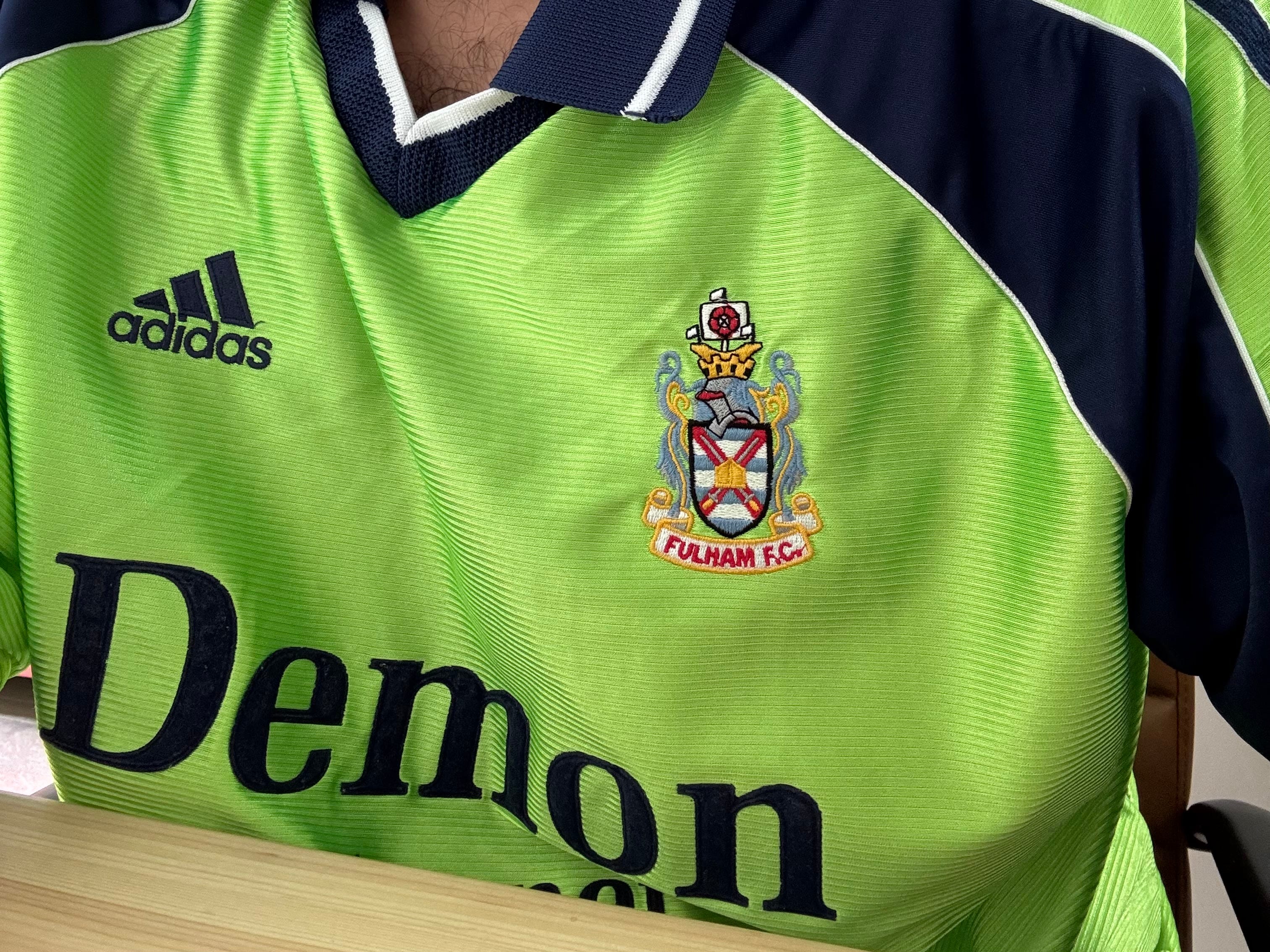
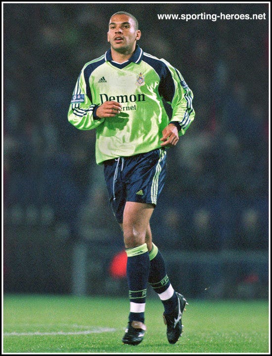
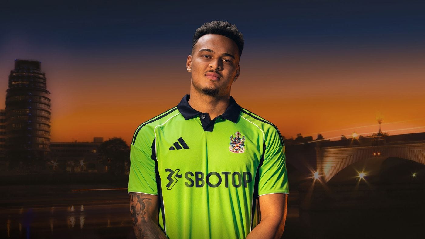
It’s finally happened. Adidas have given Fulham a little bit of respect and allowed us to jazz up our annual teamwear template by adding our old crest to our away shirt.
It’s a lovely homage to what’s become an iconic kit, albeit it one we wore in perhaps one of the dullest seasons in memory. Scott Parker probably had a poster of Paul Bracewell on his bedroom wall growing up. But I digress.
The kit launch has reignited that age-old debate: should Fulham ditch its badge for a crest used in years gone by? The answer (for me, Clive) is a resounding no.
History
Why I hear you ask? Let me count the ways. Our badge (or crest, or even logo if you’re that way inclined) is often referred to as “new”, when in fact it’s just celebrated its 24th birthday. We have had it for a shade less than 17% of our whole history.
And in that time it’s developed its own history and heritage. Our maiden Premier League season - and the 12 consecutive campaigns that followed. The Intertoto Cup. The Europa League! Wembley in front of the White Wall. It’s been there for some of the finest moments in our 146 years.
That has made it globally recognised. Many neutrals will not have a scooby who this shirt belongs to when it comes out - and that’s fine, this kit is not for them. But the point stands that our badge has done a phenomenal job in helping us pass the instant recognition test across the world.
We have fans who weren’t even alive clamouring for the return of the old badge even though they weren’t even alive when Jean Tigana’s boys bore the crest proudly as we romped to the Division One title. It’s baffling.
Then take into account we had this badge (in the form it’s represented on this shirt) for just six years. Six!
Pioneers
When we launched our new badge ahead of our first Premier League season in 2001, we were one of the first clubs to do so. This was before the deluge of clubs shoving any and all of their identifiable icons into a roundel and calling it a rebrand (I’m looking at you, Brentford).
The argument from the club was that the move gave it complete control over its identity, with many elements of the previous badge owned by the Borough of Hammersmith and Fulham. The reintroduction of it on this shirt doesn’t change that argument.
The shape and the initials within are unique in football. The biggest stick people use to beat us with is that the initials “look a bit like a swastika”, when anyone with two eyes knows that’s a bit of a reach. My son tells me the iconic badge used in our 1975 FA Cup appearance that I have tattooed on my leg looks like a wheelchair, so go figure.
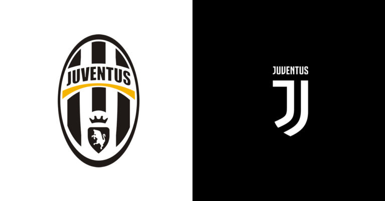
We’ve seen clubs make similar innovative changes since, to the same pushback and criticism from fans, but few have made the change so successfully. Juventus is an example that comes to mind.
Nostalgia
Look, nostalgia is great. I’m not that much of a party pooper. It’s great that the club has put some thought into dipping into our past when it comes to kit designs. Last season’s red and black stripes was an all-timer (even if you could argue those should always be our away colours). It certainly beats a turquoise abomination that’s “inspired by the Craven Cottage brickwork”.

And it’s pleasing that, though we’re not an elite Adidas club (and therefore don’t get the trefoil logo on third kit’s and the range of retro wear that comes with it), the brand with the three stripes is putting some effort into these kit collaborations. This is all wonderful stuff.
But our current badge is an intrinsic element of our identity as a football club. And I just think it’s time we gave it the respect it deserves.
I think that stating our current badge has got us recognised around the world is utter bull. The crest was adopted when we were promoted to the premier league. It became recognised because of the league we were in. Had the old crest been retained, that would have become recognised. You are also incorrect to state that we were one of the first to adopt a modern crest. A number of clubs had done so. In some cases, such us our neighbours up the road, they scraped the modern crest and went back to something more traditional.
I don’t mind a retro kit, never really liked green out-players kits though. They are goalie kits surly. but also just look crap being that the grass is green.
As for the logo, I love the new logo, Most graphic designers would say it a perfectly designed semiotical logo. This old logo is just the coat of arms of the borough. not particularly an identification of the club or the football. just the area in which the club played. Like it on a retro kit but no need to readopt it. The logo went though many designs over the years, I prefer the orig version that on the walls of craven cottage personally. But there no right of wrong in al this, its all just opinion.