


It’s been a long international break.
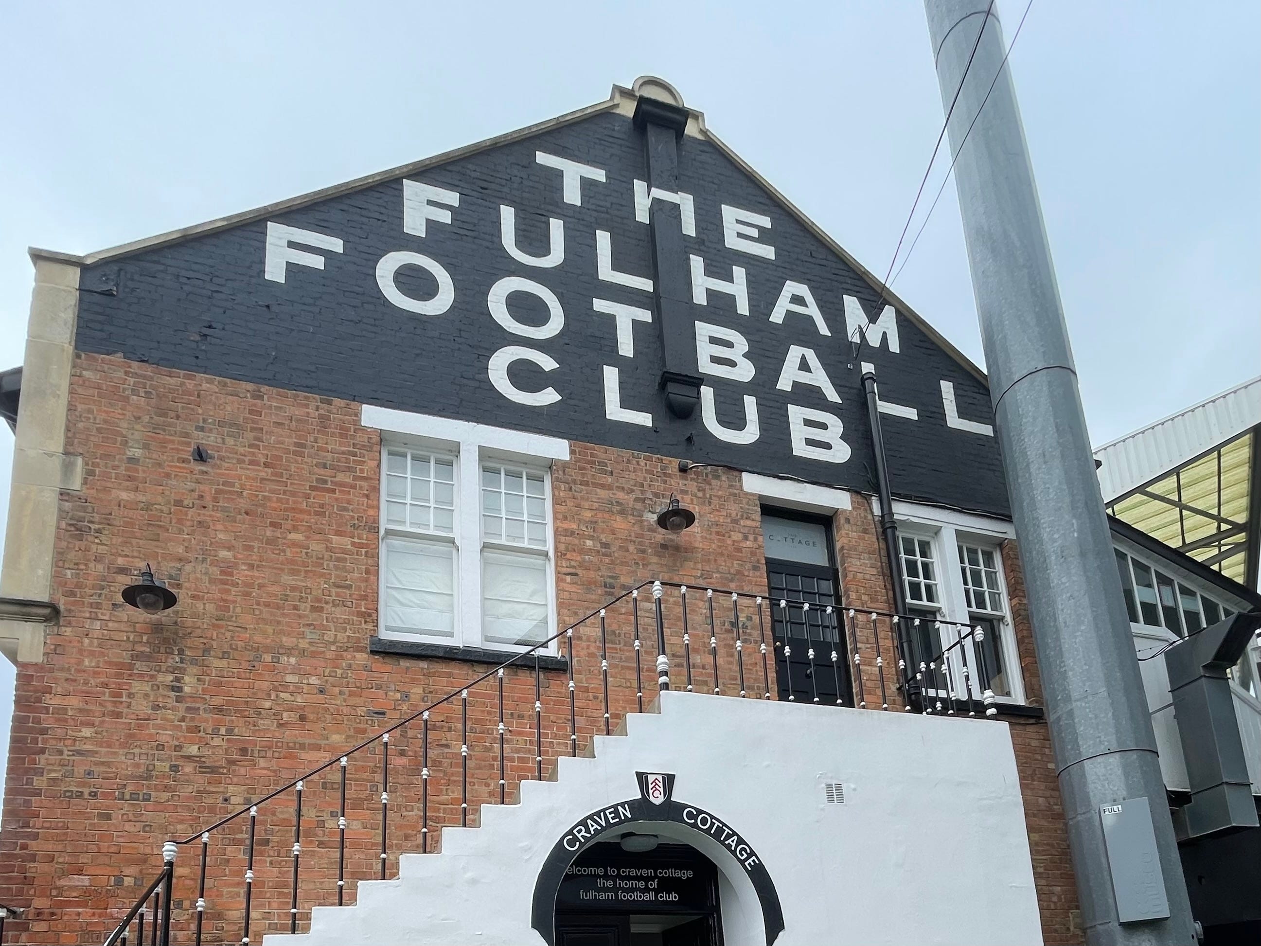
And as the saying goes, “the Devil makes work for idle thumbs”. Nevertheless, I was surprised to see Fulham unveil a new “brand identity” that I could have sworn they have been using since the summer.
Branding is close to my heart. I work across three of the country’s biggest in my day job, developing and maintaining their tones of voice.
As a result, I understand its importance. It also means my marketing bullshit detector is finely tuned.
I don’t see a new brand identity here, I see a new font.
Don’t get me wrong - it’s a great new font, and it’s cleverly developed. But it’s a font.
Marketing and football have always been uncomfortable bedfellows. It’s a white collar profession in a (formerly) working class sport.
As such, the article on the club website does make for some fun reading.
“The work responds to a changing relationship between football clubs and their audiences.”
This is a relationship change initiated by clubs and constantly rejected by fans (we’ll not say ‘audiences’, although that word is telling here). It’s not a particularly positive change, so I was surprised to see it admitted so early.
"We’re speaking to lifelong supporters, new fans, local and international audiences as well as hospitality guests, each through very different channels and touchpoints.
So says Jack Burrows, Fulham’s Marketing Director. I’m pleased to see ‘fan’ return, but we’ve already seen that, to hospitality guests, we’re merely the “local football team”? Have we got a font for that?
For what it’s worth, it’s a great idea to use ‘THE FULHAM FOOTBALL CLUB' that has adorned the Cottage for decades as the basis for this new typography. Creating an original font that’s flexible to be used anywhere is a long and hard process, so I’ll take my tongue out of my cheek to say it looks impressive and I dig it. Kudos to the club and type foundry F37.
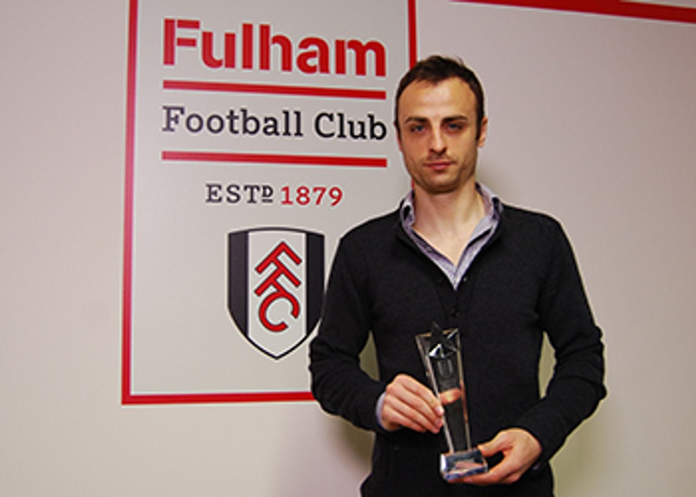
It is also lightyears ahead of our last big attempt - this odd building block monstrosity from 2011(ish). It lasted way too long and reminds me of our first Premier League relegation and subsequent years in the Championship doldrums.
The piece goes on:
“Following a period of extensive research and development, remaining true to the Club’s heritage provides the basis of the identity; Craven Cottage itself is at the centre of the new creative direction.”
I’m just relieved we’ve moved on from its brickwork.


The result is an identity designed to feel unmistakably original, and unmistakably Fulham.
“Original” - the cornerstone of our actual brand identity for the past 15+ years (despite Crystal Palace’s best attempts to claim it). We’ve struck gold with it, so I’m not surprised the club chooses to build on it, rather than change it.
“Unmistakably” Fulham - this is the line that’ll quash any hopes from fans, however large, that this new brand identity may include a redesigned crest.
If you’ve read anything by me before you’ll know I like our badge and see no need to change it, and it looks like the club agrees. We also love the adage “be careful what you wish for” in football - just look at Newcastle’s recent crest ‘reimagination’.
Of course, the club has risked stoking ire among fans - or jokes from smart-arses like me - by making a song and dance about this new font (sorry, identity). Particularly as we (now famously) sit on two points from 15. But, like it or not, we all know marketing is a core part of modern football.
I think it’s more a case of we just don’t like to be reminded of that.
You say you work in branding and you don't know the difference between 'font' and 'typeface'??? Unbelievable!!
You'll never sing in that font!
I like it, I wonder if they will release it to commons or keep it private?