


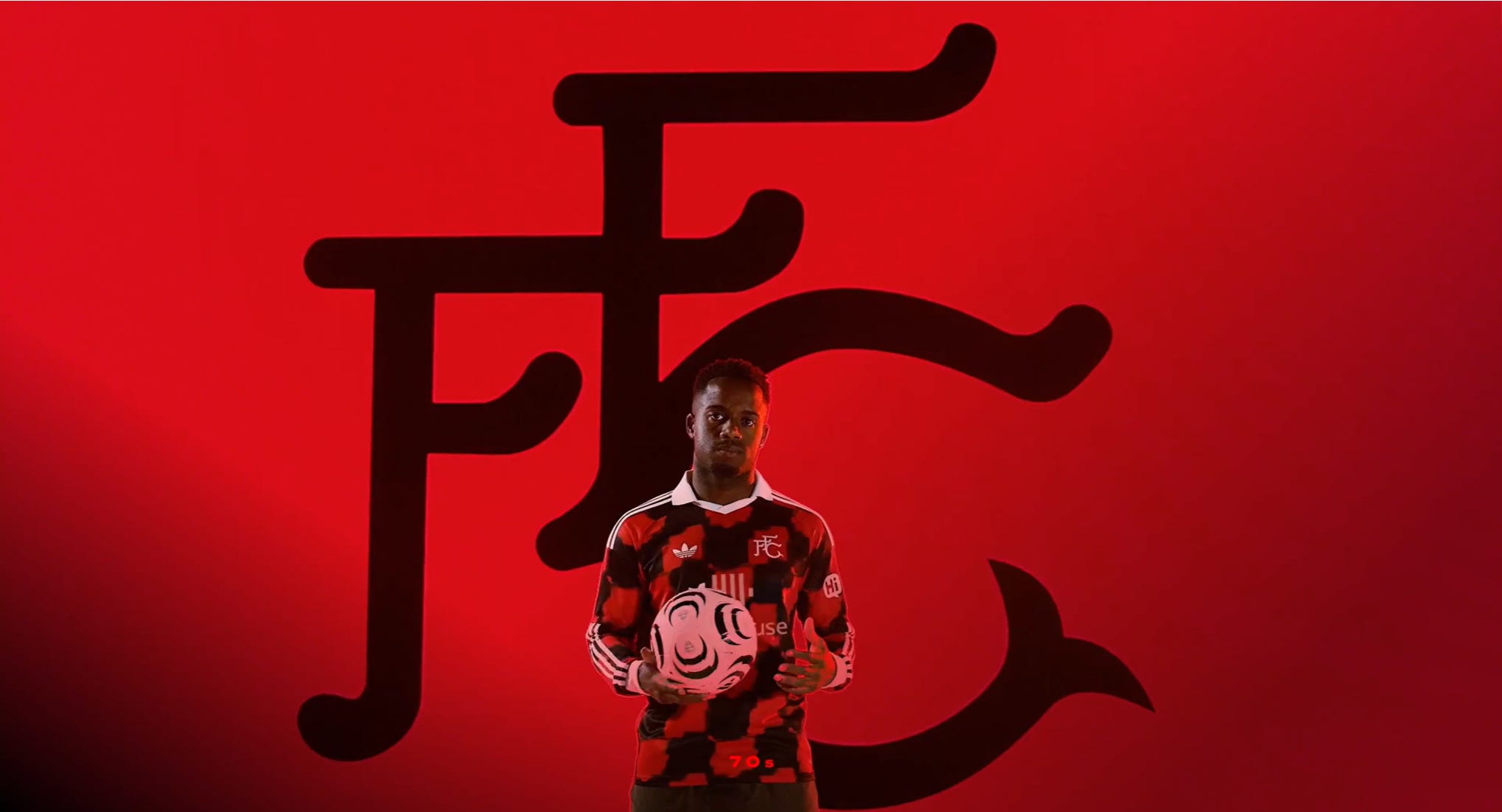
On Sunday, Fulham posted a teaser clip to let fans know that the new away kit would be revealed on Monday. A few clues - we would be returning to the black and red and the Adidas Trefoil logo would feature on the shirt. Great start.
I became obsessed with shirt collecting during the Covid lockdown period. There were so many Fulham gems that I didn’t have - and wanted. It became a bit of an addiction. I would be checking eBay and Depop daily to try and build a collection that I could perhaps pass on to my children.
The rarer shirts were becoming increasingly difficult to find, and when I would finally stumble across it, all rational thinking went out the window, to a point. This went on for a couple of years - it extended to jumpers, jackets, coats and was draining my bank account. Anyways, at some point I decided to slow down.
Although, thanks to the superb @FulhamRetro2 X page, I’ve copped a couple of his brilliant products, including his latest retro jumper that went on sale as Fulham kicked off against Al-Ahli last week.
Now, I usually buy one shirt per season. The last two being our recent away shirts. Last year’s remake of the 1999-00 green away shirt was a hit. It was genuinely great. The year before, Fulham went with black and red stripes, and I simply had to buy it.
So, Sunday’s teaser gave the impression to definitely anticipate something special. I think Fulham delivered.
The badge, a throwback to 1972, when it was introduced. A design that I’ve seen tattooed on a fair few Fulham fans. Nice; simple; classic.
The Trefoil adds another layer of nostalgia. A design that many other clubs have had on their shirts in recent seasons, and it was nice for Fulham to move away from Adidas’s current logo for the away strip.
The pattern is the only element where I’ve seen a bit of a divide. They could have gone with stripes like two years ago, and how we kitted out in 1993 and 2007. Or there was the option of the checkered design which featured on Fulham’s away shirt in 1996. A third option of the half and half style which we saw in 1995 and 2008. All these shirts had either the Borough of Hammersmith & Fulham’s coats of arms’ badge, or the current crest.
In the end, Fulham went with the patch design. Ultimately, it’s a matter of taste and opinion. Some like it, some don’t - importantly it doesn’t have much bearing on whether the team win, draws or loses. But, it does matter to fans. Personally, I like it. A bit different, a modern day design with a retro look and feel. I think it’s a great shirt.
For both home and away shirts, Fulham players have modelled the kits in both short and long sleeve. For some reason, for me, I think it looks much cleaner in long sleeve. Fulham have also made both options available for purchase, with the long sleeve slightly more expensive.
It’s unconfirmed, but usually Season Ticket Holders are given a discount on merchandise, so it may be worth waiting for your packs to arrive in the post before getting in the club store queue. I, like many, may wait for the sales before purchasing.
I think nowadays people like retro, they like nostalgia. Old designs, or badges go a long way to get the fans onside. Clubs now pivot towards releasing new takes on old classics, and it usually goes down very well. In this case, I think Fulham have got this close to bang on. Funnily enough, I don’t see us wearing this in the Premier League until October when we face Ipswich at Portman Road, but it may get a run-out against Malaga next week!
We should get a third shirt too, which by using logic, may be a brighter colour to help combat potential kit clashes when travelling to clubs like Sunderland and Newcastle.
We’re beginning a brand new era at Fulham under Alvaro Arbeloa, and there may still be some mixed feelings, some anxiety and nerves going into the new season. But, the club have provided us with an away strip that we can look forward to perhaps purchasing, wearing and/or supporting our team in.
It's basically red cow print. Awful.
First and foremost the trefoil carries a TON of weight, and should be used on most, if not all Adidas kits. If they're forcing the 3 stripes on every shoulder it's only fair to include the infinitely better logo, if preferred. (even the bland home kit would look infinitely better with a simple trefoil upgrade)The black and red combo is great to see back. The throwback crest is class and a breath of fresh air that pairs with the kit tremendously. A proper collar in white and the cuffs (especially on the long sleeves) are also excellent. The only potential drawback is the actual "checkered" pattern but I bet that grows on everyone...especially when we're seeing Garcia and the lads torment the opposition with loads of goals while rocking it. 8.5/10. We UP!
(Tough to comprehend the negative reactions but c'est la vie...and to each their own)